Introduction
The idea behind this paper is to try to understand what causes coronavirus to spread faster in one country than another. What features about a country makes it so much better or worse at coping with the pandemic. The results of this study may surprise you.
For the full code and all the files, check out the project repository here
In this article I will cover the three parts of the model:
- Collecting and preparing the data
- Clustering the countries according to their covid-19 spread rate
- Using feature data about the countries to classify them into the different clusters from step 2.
I will show parts of my code within the explanation. If you want the full model code you can find it in the GitHub repository.
Step 1: collecting and preparing the data
I collected the data from the website “Our World in Data”. You can find a link to the website in the GitHub repository
I download a CSV that includes for each country the number of total dead people from COVID-19 for each date. The CSV file I used had the dates until 31/07/2020, but the site is updated every day so new data can be added. You can find the file with the data in the GitHub repository.
For each country I named day1 (or t0 if you like) the first day with at least 5 dead people. The following data frame includes each country and the total deaths from Covid-19 from day1:
| location | total_deaths_per_million |
|---|---|
| Afghanistan | 0.128 |
| Afghanistan | 0.180 |
| Afghanistan | 0.180 |
| … | … |
| Zimbabwe | 2.691 |
| Zimbabwe | 2.759 |
| Zimbabwe | 2.566 |
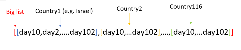
To make sure all the countries have the same number of days, I took the highest number of days all the countries have entries for, and got 102 days each. This process created a list of lists, 116 lists inside the big list, each list represent a country, and in each list of a country I have 92 entries which are the number of dead people per million that day (from day 10 to day 102):
Lastly, I took the logarithm on all the data in the list of lists, and our data is ready:
[[-1.584745299843729, -1.5005835075220182,...],...,[...,2.908266247772715, 2.908266247772715]]
Step 2: Clustering the Countries
To cluster countries I need to understand the similarity between them. To do that I create a distance matrix:
from scipy.spatial import distance_matrix
countries_dis = pd.DataFrame(distance_matrix(data, data))
This matrix shows the distance between every 2 countries:
           0          1          2    ...        113        114        115
0     0.000000   6.659591   9.301262  ...  34.289718  37.705250  23.534778
1     6.659591   0.000000   4.683849  ...  29.019417  32.331640  18.004010
2     9.301262   4.683849   0.000000  ...  25.128690  28.515404  14.322602
3    13.712355   7.769635   4.931949  ...  21.422582  24.644642  10.304785
4    15.723163  10.284375   6.822073  ...  19.221853  22.401135   8.153682
..         ...        ...        ...  ...        ...        ...        ...
111  35.660148  30.138568  26.460299  ...   3.958171   3.166323  12.199858
112  50.512313  45.760384  41.620737  ...  17.451746  15.246749  28.432069
113  34.289718  29.019417  25.128690  ...   0.000000   3.770752  11.212965
114  37.705250  32.331640  28.515404  ...   3.770752   0.000000  14.356435
115  23.534778  18.004010  14.322602  ...  11.212965  14.356435   0.000000
I intend to cluster the countries according to those distances using the Louvain method. The Louvain method is a community detection method in graphs. This method partitions the nodes of the graph into different communities according to the edge’s weights. Here, every node is a country, the weight of an edge represents the similarity between the two countries, and the communities are the clusters.
To utilize this method I will use the Networkx library and create an empty graph. To fill the graph with all of the nodes, edges and weights that I need, I will create a data frame with all the edges (there is one edge between every two countries) and the weight of every edge. The more similar two countries are, the higher the weight of the edge that connects them. In other words, the smaller the distance, the larger the weight. Therefore, I will calculate the weight as follows:
Weight = Divider/ Distance
The divider can be any number greater than 0, I choose 100.
The data frame for the graph is as follows:
 source        target     weight
Kenya         Niger  15.015936
Kenya          Mali  10.751229
Kenya       Somalia   7.292694
Kenya       Liberia   6.360043
Kenya  Burkina Faso  10.940958
...       ...           ...        ...
Italy       Austria   6.558775
Italy        Greece   3.517155
Finland       Austria  26.519906
Finland        Greece   8.918247
Austria        Greece   6.965518
Our graph is ready! Time to use the Louvain method to cluster the countries. For that we will use the community package:
import community
partition = community.best_partition(G)
The function best_partition gives us the different clusters. ‘G’ is the graph I made before. The result is saved into the variable ‘partition,’ which is a dictionary where each key is a country (node), and the value is the cluster:
{'Kenya': 0, 'Niger': 0, 'Mali': 0, 'Somalia': 0, 'Liberia': 0,...,'Austria': 2, 'Greece': 1}
The clusters are ready, let’s look at them:
Let’s look at the clusters of the countries:
- cluster 0 (51 countries): ‘Kenya’, ‘Niger’, ‘Mali’, ‘Somalia’, ‘Liberia’, ‘Burkina Faso’, ‘Tanzania’, ‘Democratic Republic of Congo’,…
- cluster 1 (22 countries): ‘South Africa’, ‘Guatemala’, ‘Honduras’, ‘Guyana’, ‘Bolivia’, ‘El Salvador’,…
- cluster 2 (43 countries): ‘Dominican Republic’, ‘Peru’, ‘Brazil’, ‘Panama’, ‘Ecuador’,…
We can also draw the graph:
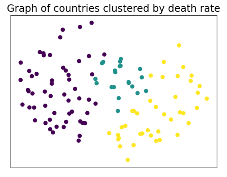
Each node is a country colored according to its cluster. The closer two countries are to each other, the more similar they are.
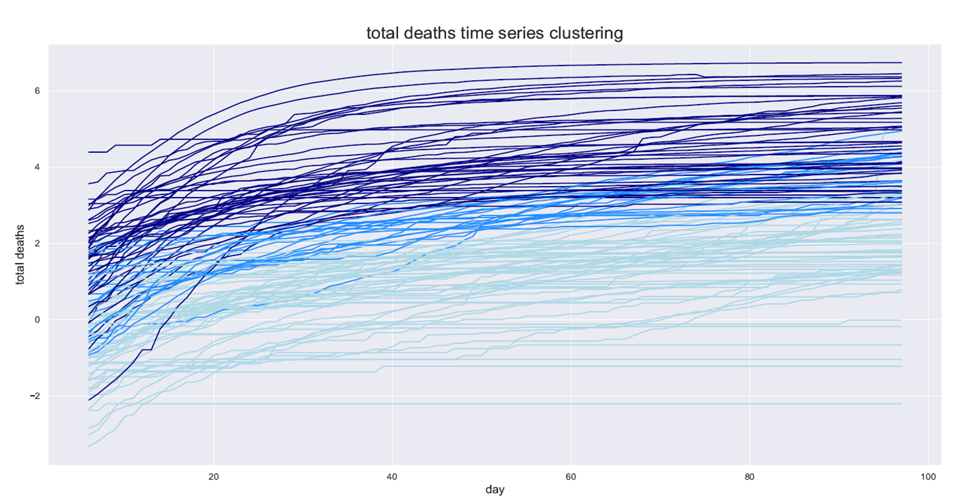
Lastly, I will plot the time series of the COVID-19 spread by day for each country and color it by the cluster:
Step 3: Predicting the country’s cluster by its data
We are finally at the fun part, finding the characteristic of a country that makes it good (or bad) when dealing with the pandemic.
The model that I am building is a supervised classification model. The labels are the clusters from the previous step, and the data are the features about the country as you can see in the following data frame:
         is lockdown  num_days  ...  Civilliberties  Obesity rate
country                         ...
Kenya              0       100  ...            4.41           7.1
Niger              0       100  ...            4.71           5.5
Mali               0       100  ...            5.59           8.6
Somalia            0       100  ...            2.94           8.3
Liberia            1        20  ...            5.59           9.9
In total there are 23 features:
Index(['is lockdown', 'num_days', 'Literacy(%)', 'population',
       'population_density', 'median_age', 'aged_65_older', 'gdp_per_capita',
       'hospital_beds_per_100k', 'latitude', 'longitude',
       'death_by_lack_of_hygiene', 'stringency index', 'cvd_death_rate',
       'diabetes_prevalence', 'life_expectancy', 'democracy_score',
       'Electoral processand pluralism', 'functioning of government',
       'Political participation', 'Political culture', 'Civilliberties',
       'Obesity rate'],
      dtype='object')
For my model, I used the XGBClassifier from the xgboost package:
# Split the data into train test
X_train, X_test, y_train, y_test = train_test_split(countries_df, labels, random_state=42, test_size=0.25,
                                                            shuffle=True)
# The xgb model
clf = xgboost.XGBClassifier()

# Fitting the data
clf.fit(X_train, y_train)

# Predicting the train data and checking the accuracy to see if the model learns
y_pred_train = clf.predict(X_train)
acc = accuracy_score(y_train, y_pred_train)
print("Accuracy of train %s is %s" % (clf, acc))

# Predicting the test data (data the model hasn’t seen) to evaluate it
y_pred_test = clf.predict(X_test)
acc = accuracy_score(y_test, y_pred_test)
print("Accuracy of test %s is %s" % (clf, acc))

# a confusion matrix on the test data
cm = confusion_matrix(y_test, y_pred_test)
print("Confusion Matrix of %s is" % (clf))
print(cm)
running the simplest model, lets see the results:
Accuracy of train XGBClassifier(objective='multi:softprob') is 1.0
Accuracy of test XGBClassifier(objective='multi:softprob') is 0.7241379310344828
Confusion Matrix of XGBClassifier(objective='multi:softprob') is
[[14  1  1]
 [ 2  2  1]
 [ 2  1  5]]
The train accuracy is 1.0 so we know that the model is learning, but our test accuracy is only 0.72, which is good but still could use improvement.
The first thing we can do to improve the model is to use feature selection. The features I have right now (e.g. population density, median age) are just my guesses of factors that I think can affect the spread of COVID-19, but not all of them are good predictors. To choose the best features I used a method called forward selection, which you can read more about: forward selection in wikipidia
The forward selection results are: GDP per capita, Obesity rate, longitude and Political culture.
Let’s see the results after feature selection:
Accuracy of train XGBClassifier(objective='multi:softprob') is 1.0
Accuracy of test XGBClassifier(objective='multi:softprob') is 0.896551724137931
Confusion Matrix of XGBClassifier(objective='multi:softprob') is
[[16  0  0]
 [ 1  5  0]
 [ 1  1  5]]
The model has improved, yay!
The features in the model are very interesting, let’s look how much each of them contributes to the prediction of the model by plotting a feature importance bar plot:
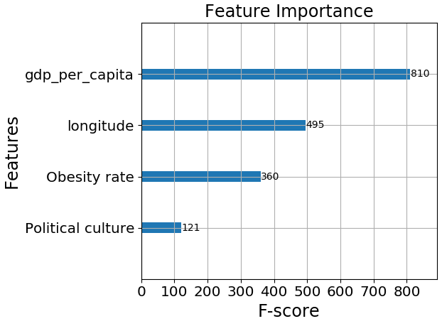
It appears that GDP per capita is the most important feature. This makes sense to me, the wealthier the country the more resources it has to do tests and give medical treatment to those in need.
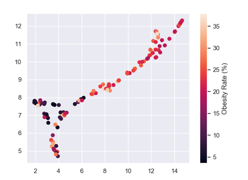
Obesity rate also makes sense because overweight people are a high-risk group, which means that an overweight person who catches COVID-19 is more likely to die from it than a person with a healthy BMI.
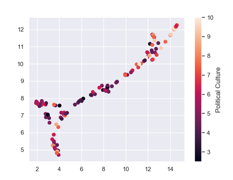
Political culture is hard to define but it is measured by the trust the people give to their government; whether or not the people listen to the government’s laws and decisions, and how much influence the people have on the government(i.e if the government really represents the people). This means the functioning of the government and the peoples trust in it matters when it comes to dealing with a pandemic. This result may not be surprising, yet it is very interesting.
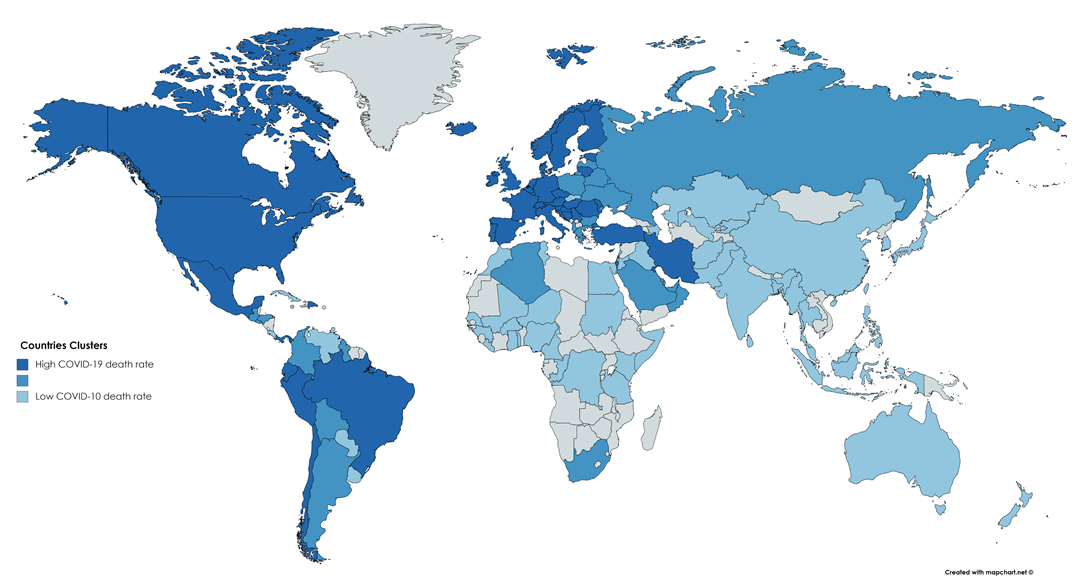
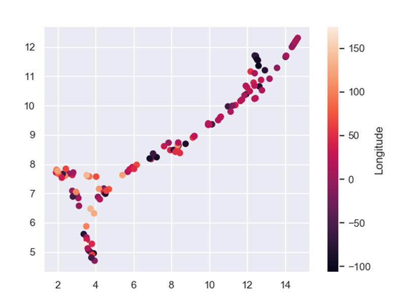
Lastly, we have the longitude feature. This feature surprised me because I cannot think of a direct influence longitude has on the COVID-19 situation. To see the longitude effect, I colored a world map by the clusters:
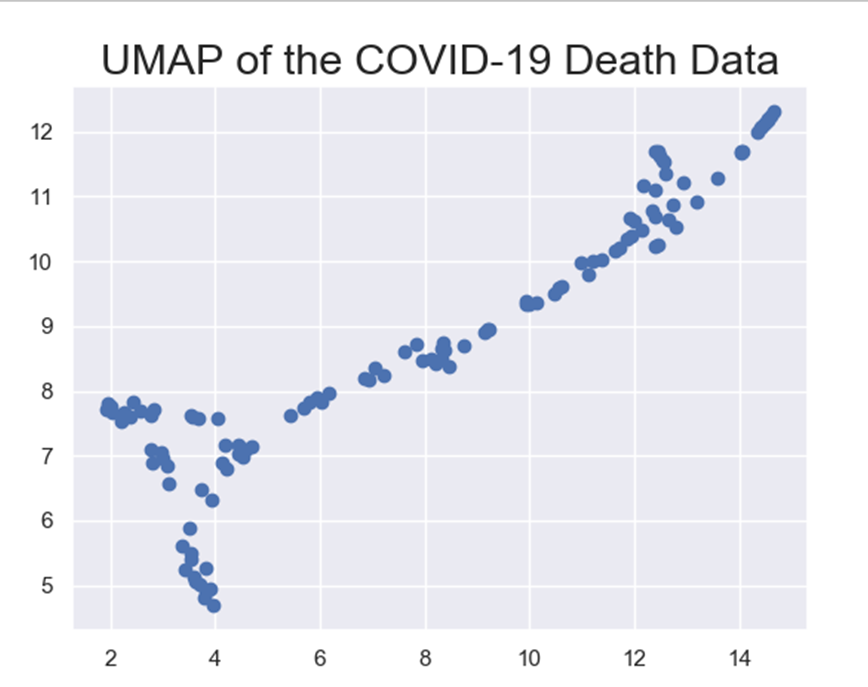
To further evaluate feature importance, let’s take a look at how all of the 4 features affect. To do that I used Uniform Manifold Approximation and Projection (UMAP). UMAP is a dimension reduction tool that helps present high dimensional data on a 2D scatter plot. Each point in the plot represent a sample, which in this case represents a country. Let’s see a UMAP representing the COVID-19 deaths data:
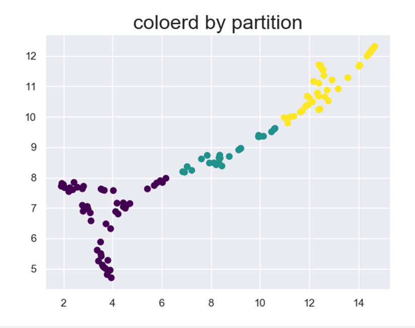
Now let’s color it by the clusters we got in the previous step:
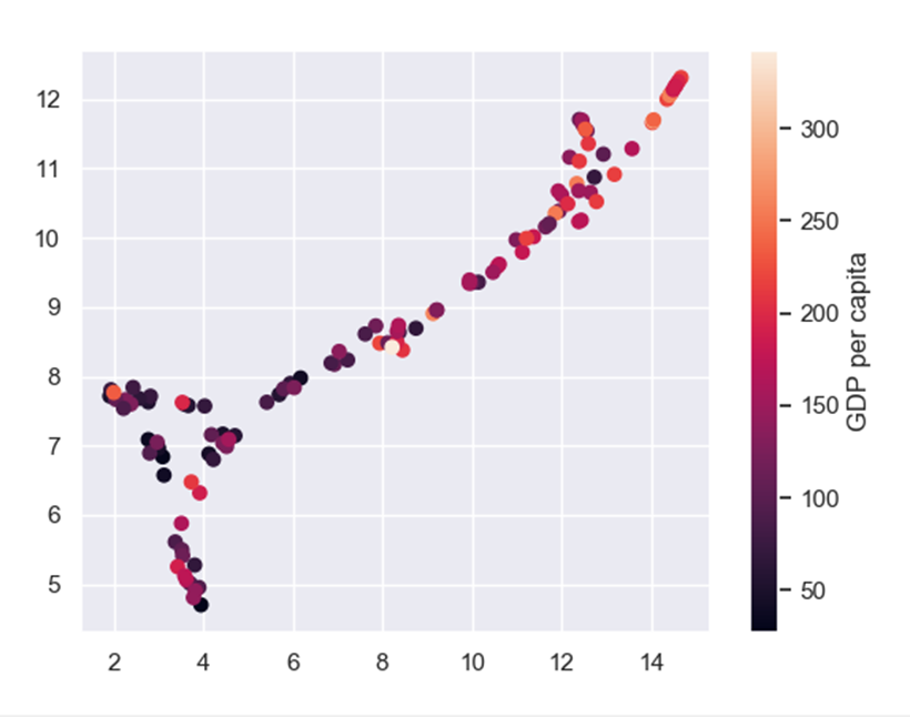
And if we color the UMAP by the features from the feature selection:
Another technique we can use is model tuning. Every machine learning model, XGBoost included, has different parameters that can be changed to improve model performance. Sadly, the only way to find those much-wanted parameters is to try A LOT of options and hope we will get the best one. I used GridSearchCV to tune my model. If you want to read more about it, click here.
The parameters I got (the parameters that do not appear means the default option is the best): learning_rate=0.5, max_depth=4, n_estimators=400
Let’s look at our final results:
 Accuracy of train XGBClassifier(learning_rate=0.5, max_depth=4, n_estimators=400,
              objective='multi:softprob') is 1.0
Accuracy of test XGBClassifier(learning_rate=0.5, max_depth=4, n_estimators=400,
              objective='multi:softprob') is 0.9310344827586207
Confusion Matrix of XGBClassifier(learning_rate=0.5, max_depth=4, n_estimators=400,
              objective='multi:softprob') is
[[15  0  0]
 [ 0  7  0]
 [ 1  1  5]]
The accuracy has gone up to 93%! 93% might not seem as exciting as the 99.8% models we see on Kaggle, but if we look at the confusion matrix we can see there are only two countries that are predicted incorrectly.
Conclusion
The more we explore and analyze the pandemic, the more we understand it, and that was the purpose of this project. The features that affect a countries ability to cope with the pandemic are not the ones you may expect, and the features that you may expect to influence the pandemic end up being very insignificant.
For example, I did not expect obesity rate to have an effect at all, especially not that big of an effect, but after this study I learned that weight has a lot to do with the ability of the body to cope with COVID-19.
Furthermore, since mostly older people die from the disease I thought the median age or the percent of people over the age of sixty-fivewould have a huge influence, but not according to this model (I tried to add those features and the predication accuracy got worse).
I hope you learned from this article both about machine learning and about COVID-19, and that you found the reading fun.
Thanks
This project was made by Noam Rozenboim in collaboration with Professor Yoram Louzoun from Bar Ilan university Link to Yoram Louzoun’s lab: http://yolo.math.biu.ac.il/
Links
- Covid-19 daily deaths dataset: https://ourworldindata.org/coronavirus
- Countries features resources: * https://en.wikipedia.org/wiki/Democracy_Index * https://www.citypopulation.de/en/world/bymap/AirTrafficPassengers.html * https://en.wikipedia.org/wiki/National_responses_to_the_COVID-19_pandemic * https://developers.google.com/public-data/docs/canonical/countries_csv * https://ourworldindata.org